Know Your Type : Thirsty Thursday
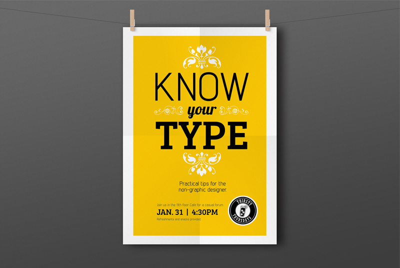
A Thirsty Thursday logo, presentation, and poster for a monthly social event at work to engage the internal community in the hopes to spark new connections and ideas. My design partner and I presented at the first one discussing typography which was divided into 2 parts; the etymology of fonts and humorous examples of type-gone-wrong. This spoke of things to avoid and outlined best practices for using type in workplace documents.


